Anthony Burrill is a Graphic Artist, Printmaker, and Designer and is famous for his text based compositions which utilise primary colours and geometric shapes. Burrill studied graphic design and Leeds Polytechnic and then completed an MA in Graphic Design at The Royal College of Art. He has had work exhibited in The V&A in London and the Cooper-Hewitt National Design Museum in New York, and has worked with a range of companies and organisations including Google, Apple, and the London Underground.
Arguably his most famous work is his letterpress posters and the most famous piece is his “Work hard & be nice to people” poster.
Credit: http://anthonyburrill.com/
The article I have chosen is based on an interview with Anthony Burrill and in it he discusses the introduction of digital techniques and how this has impacted the had on how he works, including how he has tried to maintain a handcrafted feel in his work. He also discussed curating phrases, the importance of context, and how people can respond to your work in a way you wouldn’t expect.
I have drafted some initial ideas for the layout of my double page spread which I have included below. For the titles I have used the font Din as I feel this most closely resembles Anthony Burrill’s work as it is a very geometric sans serif font. In the first design I tried to include a lot of white space to emulate the clean look of Burrill’s work. the orange boxes in this design would be images of his posters including one very large image in the top right corner of the second page. The text would be slit across three columns with the majority being in the fourth column. It would be slit into blocks with contrasting headings based n on the questions asked in the interview.
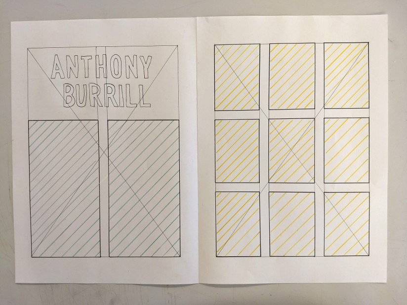
In my second design the first page would be based on a two column grid with the text split across both columns, but all on one page. The second page of the double page spread would be entirely comprised of images of Anthony Burrill’s work in a very regular grid which emulate the very rigid structure he uses in his posters which comes from the traditional techniques he uses.
As part of the first brief I had to choose a location for the exhibition the poster is advertising. The only requirements for this were that it was a real place and that it was in some way relevant to the designer.
Margaret Calvert is so well known for her work to do with transport and I wanted my venue to reflect this. My first thought was to find a location that would allow visitors to drive around the exhibition however I realised that this wouldn’t be a particularly great way of displaying the signs for three main reasons: the first is that this would have the potential to be very dangerous because the signs could confuse drivers and lead to accidents; the second was that I really struggled to find a site that would be appropriate and have any relevance to Margaret Calvert; the third and most important is that I decided that this format would not work because it wouldn’t actually encourage people to look at road signs.
My next idea was to hold the exhibition in a disused London Underground Station. I thought this would link nicely to Margaret Calvert work which includes the Rail Alphabet Typeface as well being in the city in which she studied (Calvert studied at Chelsea College of Art). I then had to pick a station and after looking into some of the disused stations I decided on Aldwych Tube Station. There were a number of reasons for this decision, the first is that its location is very central and it was a very well established station as it was in use for nearly 100 years. Secondly, the station was in use when Margaret Calvert started working. And finally Aldwych Station is still used for filming which means that it would still be in a good condition and could be used for my exhibition.
This slideshow requires JavaScript.
Additionally the date I picked for my exhibition is significant because it would be on the 55th anniversary of Margaret Calvert and Jack Kinneir’s new sign system becoming law (1st January 1965). The Worboys Committee commissioned the redesign in 1963.
Almost everyone is familiar with Margaret Calvert’s work and see it on a daily basis although very few people realise this. Margaret Calvert is one of the designers responsible for all our road signs. When the first motorways opened in the 1960s Jock Kinnier was tasked with redesigning and standardising roadsigns which he did along with his colleague Margaret Calvert, her most famous signs are arguably the children crossing sign, the men at work sign, and the cattle sign. She is also responsible for the transport font used on all road signs. Over the last 50 years she has continued to work as a designer, often using her road signs to create art pieces.
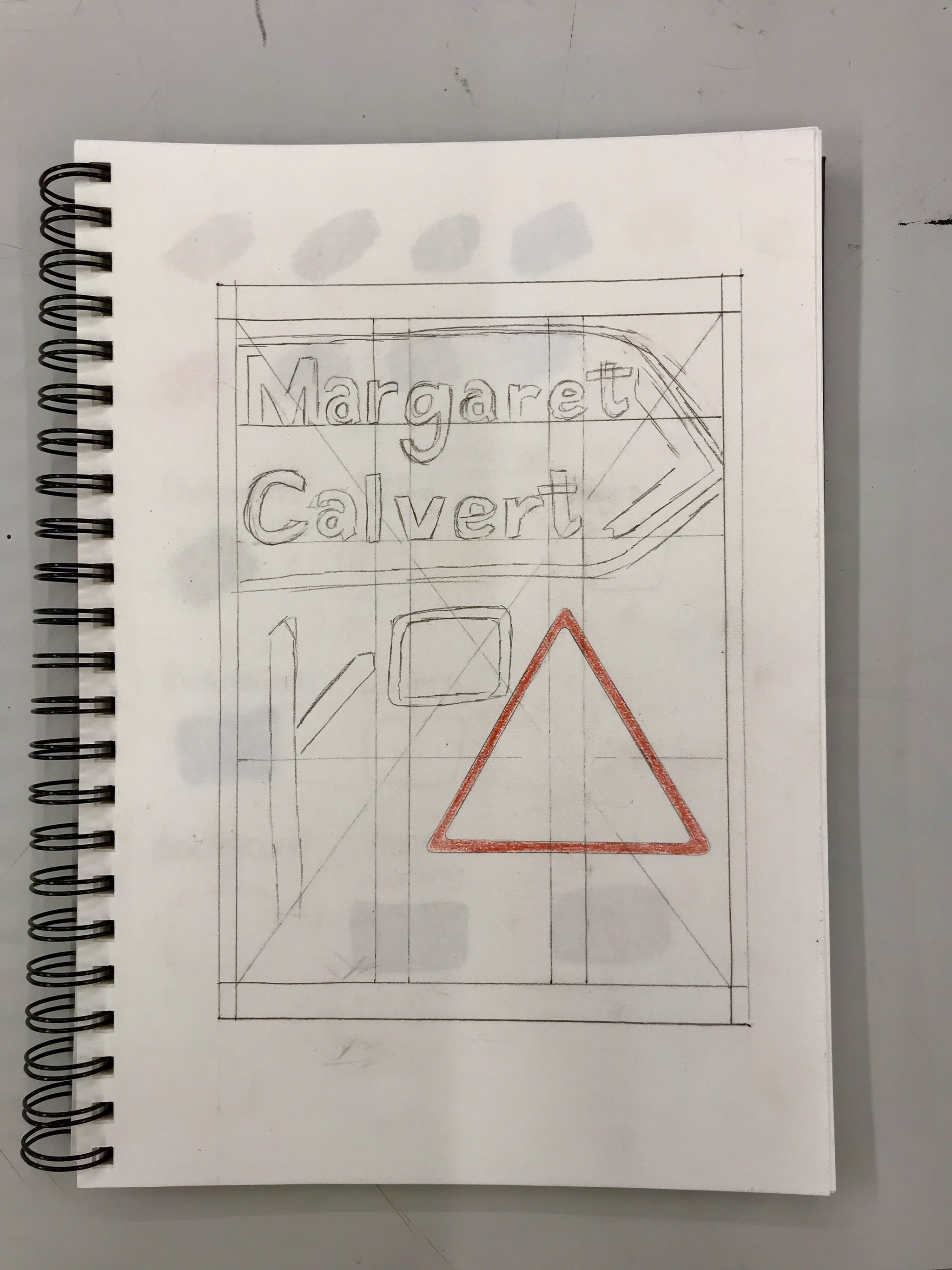
For our first brief in the module Pictue Symbol Icon I have decided to design a poster for an exhibition of Margaret Calvert’s work. I think this could be really interesting because well designed roadsigns, like Kinnier and Calvert’s, get their message across without being noticed, so focusing on them is something very few people do – once they’ve passed their theory test.
I started by analysing some of the roadsigns to establish the common themes that run through them all, one of the most important features of the roadsigns is the colour scheme. The only colours used, besides black and white are red, yellow, green, and blue. Additionally, she only uses one or two colours (besides black and white) on any sign and almost none of the writing is black. The font she designed, is a slab serif font and is very clear and easy to read.
For my poster design I would try to stick to the design style used on the signs, limited colour range, and simple clear fonts. I will also include some of the most recognisable features from the signs, possibly the arrows and roundabouts or some of the most famous characters, like Patience the cow, the schoolchildren, or the workman.
This slideshow requires JavaScript.
My next step will be to digitalise my initial design ideas on adobe illustrator and rework them so that they are more visually pleasing. I also need to decide on the location of the exhibition, I’m currently thinking about doing some kind of outdoor exhibition which visitors would drive through, however I’m not sure at the moment and need to do more research because that has the potential to be very dangerous.
Today was spent focusing on typography. We started by learning about the history of typography and the principles of typography (below are my notes from this).
This slideshow requires JavaScript.
We then moved on to look at representing a work through how it is written. I initially picked the word “stairs” and imitating the shape of actual stairs through the way the word is written.
I wasn’t really happy with any of the iterations of this so I decided to use a palindrome because I thought the potential symmetry of a word could be really interesting. I initially experimented with drawing the letters on different levels and in different sizes whilst still maintaining the symmetry of the words. In the end I did, however, choose to draw the letters all the same size and the last to back to front so that is symmetrical in the
y-axis. After we had finished these we commented on each others work, writing our comments on sticky notes.
This slideshow requires JavaScript.
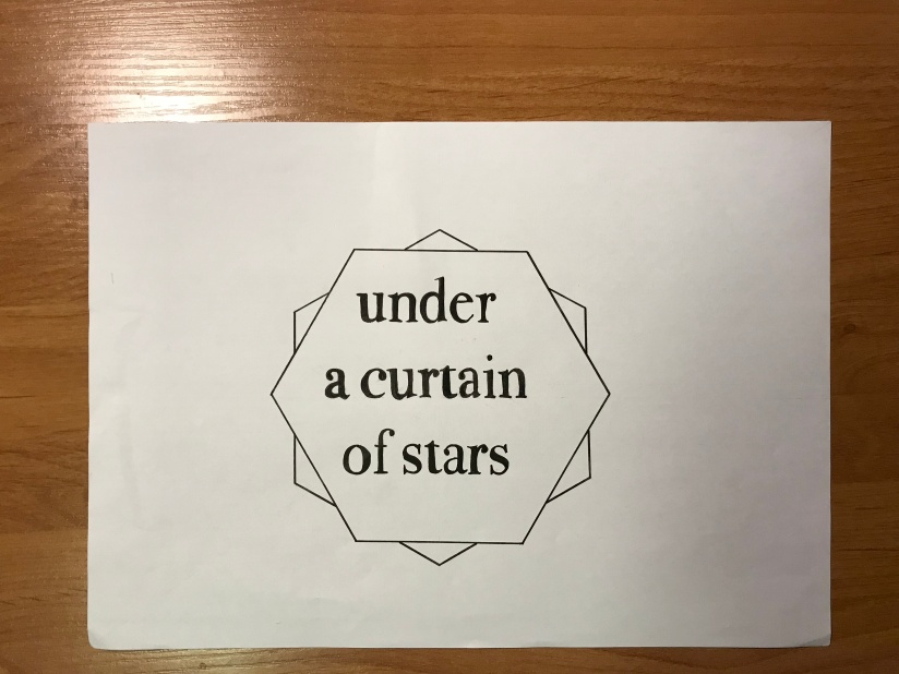
After writing single words we moved on to writing phrases and incorporating geometric shapes. For this I chose a quote from my favourite book ‘The Night Circus’ by Erin Morgenstern:
“Like stepping into a fairy tale under
a curtain of stars.”
I chose this because it would be very difficult to represent visually whilst still being very descriptive, however I very quickly realised that this was too long a phrase and shortened it to just the last five words. I wanted to represent the stars through the use of geometric shapes without actually drawing stars so I drew two hexagons layered on top of each other.
Today was the first day of our third module “Picture Symbol Icon” and we started of by looking at design principles through photography. We were given seven different design principles and given 10 minutes for each to take a photo that focused on this technique.
#1 Symmetry
#2 Rule of Thirds
#3 Perspective
#4 Colour
(using a single colour for emphasis)
#5 Palettes
#6 Branding
(for this we looked at how companies use the principles above to create their brand)
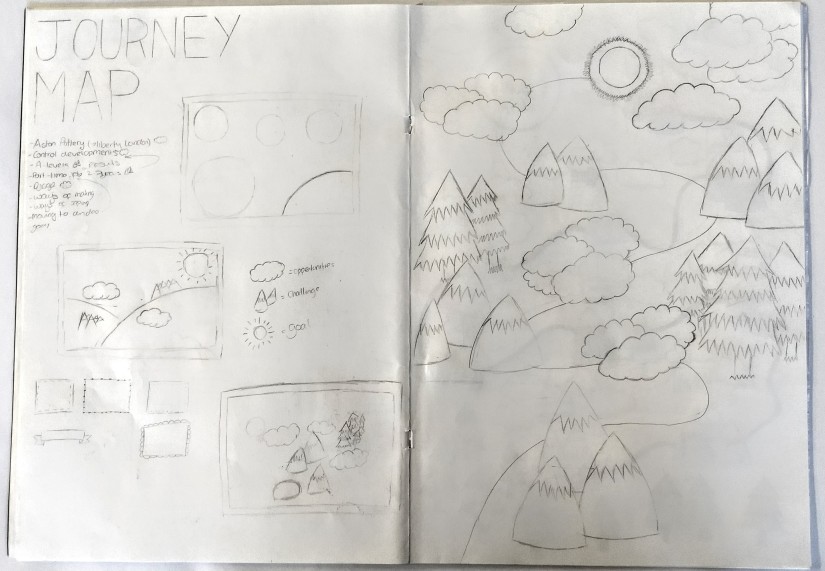
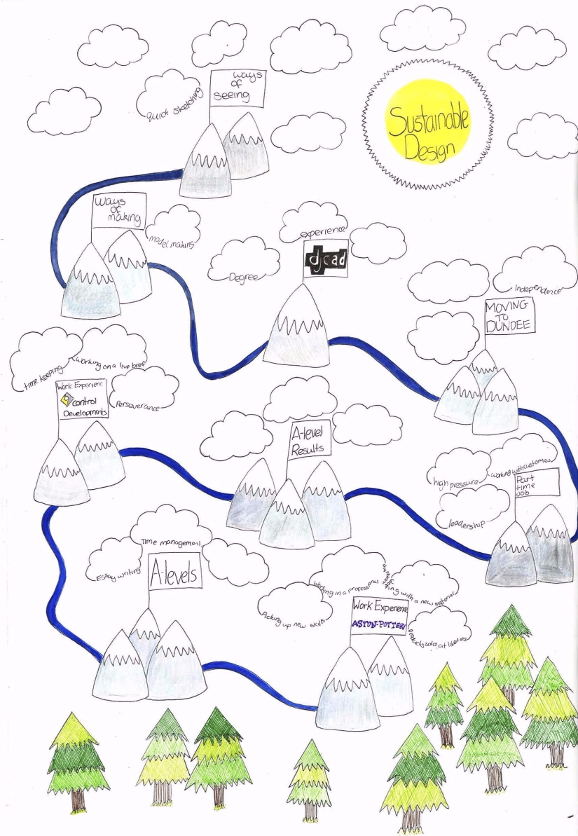
As the final part of Ways of Seeing, we were asked to design a journey map detailing our journey up to now and what we plan ti do in the future. We were asked to include the qualifications and skills we had when we applied to DJCAD and the skills we have acquired during the first two modules of the course.
I decided that my map would focus on three main areas: education, work experience, and work. I started by exploring different designs I could use, including space and a more realistic landscape scene. Then once I had decided on the theme I was going to use I did a more detailed sketch so that to work out what all the individual elements of the map would look like.
In my final design I drew mountains to represent all of the events because they all required work to complete. Around each mountain I drew clouds with the skills I gained from each experience and the opportunities they gave me. The events on the map are in chronological order, the sun at the top represents my main goal and the path follows the events up towards it.
Personally, my main goal is to work as a product designer but focussing on sustainable and environmentally friendly design and ideally make sustainable products more accessible to everyone.
I am really pleased with my journey map, considering how much time I had to complete it. If I had had longer I would have added more detail and would have added more drawings to make the page look more complete, especially by adding more trees further up.
Finally we had to upload a GIF of our Arduino characters and this can be found on my Instagram page
During week seven we took part in The Big Draw as a class. The Big Draw is all about collective drawing and aims to remove “I can’t Draw” from our vocabulary, so as a class we were given the task of creating a peaceful protest to promote the use of pencils or pixels. Working in smaller groups, we had to design posters and slogans to promote our point of view at the start of the week and then later on we spent an afternoon in Slessor gardens drawing on the pavement in chalk.
We started of by looking at past activist campaigns for inspiration, we were looking for something with a very simple slogan that would be easy to adapt to our ‘protest’. As a group, we decided not to pick one over the other with two posters promoting pencils and the other two were promoting pixels but neither sets of posters were actually opposing the each other.
Taking this into account, we decided to base our posters on the “Give Peas a Chance” bridge on the M25. From this we got the two slogans “Give Pens a Chance” and “Give Pencils a Chance”. We then decided to link the other posters graphically by using similar fonts to the one used in the graffiti and using almost exclusively black and white. The other two slogans our group used were “Peter Piper Picked a Pixel” and “Save the Pixel”.
For our drawing at Slessor gardens, we decided to do one large drawing as a group, using the slogan “Give Peas a Chance” with drawings of Peas to represent pens and pencils and Pac-man to represent the digital version.
The final part of the task was to upload photos of the day to social media, which I did using my Instagram account
As a group I think worked really well together and produced a cohesive set of poster which were effective in getting our point across. I do think that we could have pushed ourselves a bit more and made slightly more complicated posters, however the posters we made were very effective. I also think that design activism is very important and it was really interesting to see how all the groups responded to the issue.
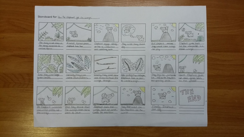
Brief: “Hello World” the birth of your RGB Arduino Character
As part of the new module ‘Ways of making’ we have focussed on drawing as a way to become more aware of our surroundings. We have also learnt simple coding using an Arduino board. To demonstrate our learning we were asked to create a character and a storyboard to tell their story.
Origami model of a fox with wings
Origami elephants
After some sketching and modelling I decided to create a flying elephant – for my final model I used handmade paper and wooden sticks for extra strength.
For the storyboard I decided to tell the story of how my elephant got its wings and reflect the process of using an Arduino board (connecting components and using a power source). I also tried to represent the RGB colour system in the creation of the wings.
Origami elephant with wings
Elephant sat on box
Pixels or Pencils?
At school the focus was on drawing designs by hand. At GCSE I used SketchUp to show a small part of my design but not until I had finalised the design and started construction. At A-Level CAD was used solely to use the laser cutter not as another way to present design.
Personally, I find pencil drawing more immediate than CAD, but CAD does give a new perspective on the design. I also find making physical models really useful as a means of exploring the technical side of the design and how it will interact with the real world. For me, pencils can’t be replaced but pixels do bring a new perspective.
Our final project in ‘Ways of Making’ was ‘Navigating Experiences’ which lasted two weeks and focused on how we interact with the Urban landscape. The brief was to design a new experience in pairs for a user to playfully navigate a place. We were also encouraged to think about getting lost, exploring, asking someone for directions, and picking a random route. Mainly because most new navigating experiences allow us to avoid these experiences but prevent us from interacting with our surroundings and people around us.
As this was such an open brief we decided our first step should be to decide what we wanted to design and who we wanted to design it for. Our main inspiration was the Dead Drops network, especially the way it allows you to share digital information while making you go to a physical location to get it. From this we decided that we wanted to have a physical product in set locations around a city and an app that would know where they are and send you to them to get information. We also decided that our app would be aimed at everyone and encourage to get to know their city.
We finally decided that our app would be called EARTH and would use your interests and needs to give you a list of places to visit in a city. Instead of giving you a route to follow, the app guides you with an arrow so that you still have to explore the city to find your route. Once you get to a location you will be given a picture of an object to fin. Once you take a picture through the app AR technology within it will give you information about the place, advice from local people, and music to listen to. When you first sign up for the app you will be asked about your interest, your preferences, and some basic information which the app will use to tailor your experience and ensure that all suggested locations meet your needs. When you go to use the app it will ask you: where you are, how long you want to spend, what your budget is, what type of day you want to have, and if you have any requirements; using this information the app will generate a list of places for you to visit.
We started by doing some rough sketches of the app pages so that we could brainstorm and make sure we included all the features of the app, we then made a paper model of the app which gave us a better idea of how the pages would work together in reality. After establishing the content of the app we needed to work on how the app would look so we did some more sketches, in colour, and then made a prototype app and a 3d drawing on rhino to see what the app would look like on a phone.
This slideshow requires JavaScript.
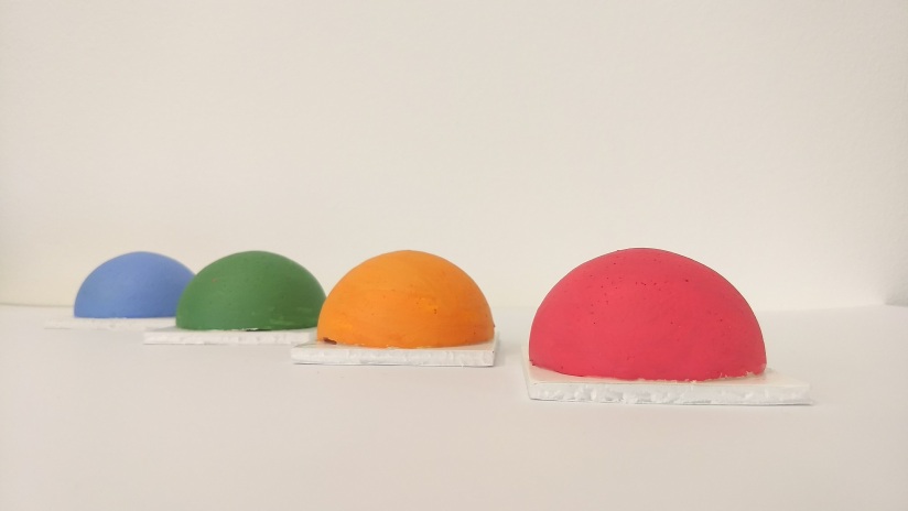
Our design changed a lot over the two weeks, however the aspect that changed the most was the physical presence in each location. Initially we wanted to have some kind of ‘touch pad’ at each location which would change colour to show how many people had visited that location, the user would touch their phone to it and it would connect and transfer files, very much like the dead drops network, however a lot of the dead drops USBs are either broken or corrupted and this made us realise how much upkeep and money this would take. Our next idea was inspired by a QR code I found in Prague built into the pavement. This would work really well in a single city if you worked with the local council, however if you made the project global this would be almost impossible. So we finally decided that when someone wanted to submit a location to be added they would take a picture of a noteworthy permanent feature of the location and we would then use AR technology to incorporate it into the app.
Models of the touch padsLeft: QR code in Prague Right: model QR code
We had two other ideas for the app that we decided against in the end. The first was to make the app more like current social media sites in that you could share your experiences with friends and ‘follow’ them. We decided, however, that this wouldn’t be safe for an app based on location. We did consider safety measures like making the ‘following’ system very secure and using ‘delayed posting’ which would use your location to ensure that you’re not near the place you’re posting about when the post is actually uploaded, however we decided that we wouldn’t be able to stop people from abusing this feature and as a result we did not include it. The other idea was to create a worldwide competition between the cities with the app in place to see which was the most engaged city, however we decided we wanted the app to be more about exploring your own city and other cities so we decided to also not include this feature.
In conclusion, I’m really happy with how far we got with the development of the app, I feel that we had a really good idea of all the features and how they would work together and we had a working prototype. I do, however, think there are still issues with our design, mainly that while it does encourage you to explore your city it does not really encourage human interaction and still uses mobile phones. It would have been nice to be able to remove phones from the equation but the vast majority of people have one the easiest way to make something accessible is to make it available in their phones. Additionally I think we worked well as a team in that we were good at dividing up the work and we got a lot done in the two weeks, however, I think following two one week projects with a two week project made us feel like we had a lot more time then we actually had which made time management difficult. Over the last four weeks I have learnt the importance of planning and I think this finally showed in this project as well as improving my modelling skills and how important and useful modelling is for design.
This week our task involved looking at public spaces, how they encourage people to interact, and how cities are responding to the evolving landscape of connectivity, especially in regard to ‘smart cities’.
To start our research we split into groups and visited different public spaces in Dundee. We started by going to St. Mary’s church and speaking to the Minister about how the church is used as a public space and then moved onto Slessor Gardens. In both locations we observed how people interacted with the space, however there were very few people actually in either of the spaces, arguably this was because the spaces were so separate from where people actually were, this helped inform my design and my chosen location.
Taking inspiration from parasitic architecture, I decided to design a temporary installation for City Square that would encourage people to connect without technology. The piece should be very conspicuous and look out of place to draw the attention of passers by and be inviting to encourage them to interact with it and each other. The main reason for the installation being temporary is so that it does not become mundane and that in the future the memory of it would still connect people. I wanted to design a space that would take people out of their regular lives whilst still being very similar so I chose to base my design on something most people would have had at least some experience of from their childhood – a treehouse.
This slideshow requires JavaScript.
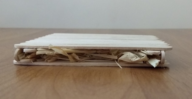
The treehouse would be constructed very simply out of pine with straw as insulation and when it is built it will be completely plain. Paint will be left inside the treehouse and people will be encouraged to paint it however they want.
To construct my model I used lollipop sticks to represent to planks of wood and glued them together. Additionally the model was constructed to a scale of 1:25. Unlike last week I had a much clearer idea of my design as I started constructing my model, however I failed to think about how the scale of the model would affect the overall look or it meaning that while my model represents my design, it does not show what the treehouse would look like in situ.
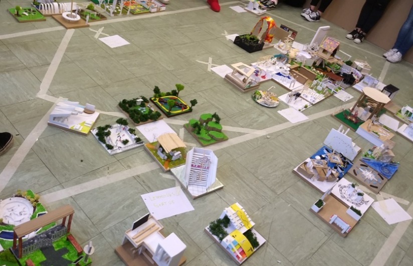
After all the models had been constructed, as a class we built a city using everyone’s public space models. The most notable thing was how green and colourful the whole city was and it would be interesting to see if it would be possible to actually make a city that focused on green space and public spaces. Additionally we all started with completely blank canvases, however in real life you would very rarely be presented with an empty space so we weren’t faced with any of the constraints you would have in real life. I also think the variation in the models is amazing, because we were all given the same guidelines.
In summary, I learnt about the importance of public spaces and how they can have a huge impact on how we connect with each other. By focusing on human interaction and the importance of this for health, i designed a space that would encourage people to step back and appreciate a more simple experience. I consciously chose not to include any technology in the piece because constantly being connected on-line can prevent us from enjoying the real world and connecting with real people.
My model was also a lot simpler this time and that made the construction easier because I did not have to worry about the properties of different materials. If I were to do this again I would like to place more restrictions on the design as I feel like my design could be placed almost any where, however in the real world you would have to design for a specific location.


 Credit: http://anthonyburrill.com/
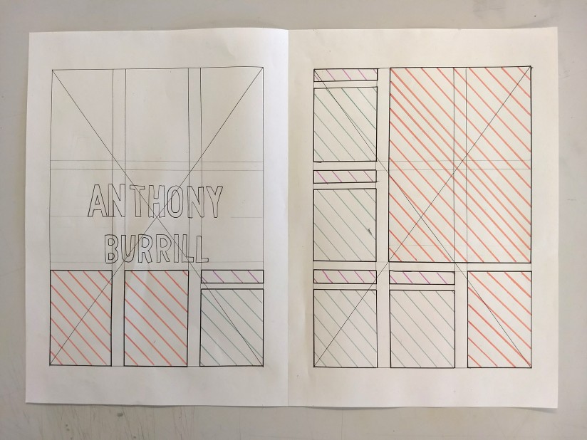


 (using a single colour for emphasis)


