Design Methods for Insight Gathering – Reflection

This module, design methods for insight gathering, has been very different to the modules we did earlier in the year and presented new challenges and opportunities. Most of this module was based around the interview. We did, however, start with a smaller, two-day brief about the history of photography.

The brief was “Produce a visual timeline of important moments in the evolution of the camera and photograph.” There weren’t any restrictions on the form but we were encouraged to include our personal experiences with photography so I decided to include old family photos, I was be able to get hold of a lot from the early twentieth century and one from the 1880s. I was inspired by photo peg lines that are very popular now. Completing this brief took me the full two days and I think spending as much time as possible on it was a good decision because the brief was really meant to build a foundation for the rest of the module and I think in my case I achieved this. Spending so much time looking at the history of photography, especially in the context of my family, meant that I went into the main brief very conscious of the potential impact of photos. I was also very pleased with the quality of the timeline I made, it was very different to most of the other timelines in the class. Initially I considered making it digitally, however I realised that I wouldn’t be able to achieve the same look I could if I made a physical timeline.

The rest of the module was spent on the main brief: “You are to gather research material about how first year Dundee University Students use photography. Specifically, you are gathering data, which illustrates the relationship students have with technology and photography.” This made design methods for insight gathering very different to the other modules we have done so far because everything we worked on was part of the same brief. Everything I had to do was linked to the next thing so everything had to be completed in order and time management was very important as I couldn’t spend too much time on some sections because others were going to take a lot more time.

The interview itself went really well, the whole thing lasted about half an hour and in total I ended up with seventeen minutes of footage. I started off by presenting my participant with the information and consent form I had made and the list of questions I was going to ask him. I think doing this made him more comfortable because he knew what to expect throughout the interview and had time to prepare his answers meaning he was more confident in his answers which in turn meant that he gave more insightful answers.

After conducting the interview, I had to transcribe it and edit the video. Transcribing the interview was a very tedious process and took a full day to complete because I had so much footage. However, I was glad I had so much when we did the affinity mapping workshop and started to decide which questions I would include in the final video. I ended up mainly including questions from the second half of the interview because that was when my participant was most comfortable and so gave the most insightful answers.

Overall I am very pleased with my final video, there are definitely changes I would make if I did it again, especially with the background of the interview and including my participants photos in the video, additionally, I think the audio quality of my video isn’t great; I would use a different audio recorder in the future. I am, however, very pleased with the quality of the interview itself and the insights I could gather. I also gained new skills that will be useful in the future.

Why We Use Design Ethnography

Design Ethnography is defined as “The study of people in their natural settings; a descriptive account of social life and culture in a defined social system, based on qualitative methods (e.g., detailed observations, unstructured interviews, analysis of documents).” Or more simply the “description of people”.

Having a clear idea of the life someone leads means that a designer can work efficiently with them. Design ethnography should lead to the designer being both sympathetic and empathetic towards the participant; meaning that they not only understand the person they are designing for but that they have developed the ability to understand and share their emotions.

Another key aspect of design ethnography is helping people understand that their stories are important. Keeping the user involved in the design tells them that the designer is willing to listen to their thoughts and value their opinion. This will let the users understand their value in the process. This can help ensure that the end user of a product or service is the focus of the process so that the final product fulfils its original purpose. The whole process should be rooted in the needs of the user, the designer should not just be looking at the problem in isolation from the rest of the user’s life and ignoring other factors that could influence the project.

Service design is defined as “The activity of planning and organising people, infrastructure, communication and material components of a service in order to improve its quality and the interaction between service provider and customers. The purpose of service design methodologies is to design according to the needs of customers or participants, so that the service is user-friendly, competitive and relevant to the customers” Design ethnography is a key part of service design the service must meet the needs of user and engaging them in the process is the best way to do this. Listening to the stories of the intended users of a service makes the process user-centred and by extension the final service. Additionally, the sense of empathy created by design ethnography means that the designer can fully understand the impact the service could have on the user.

All data collected must be analysed for insights to inform the design. The insight should be new and relevant to the design so that they inspire the outcome, influencing the way the designer looks at the problem/design opportunity. Insights aren’t just quotes or observations from the participant, they should be based on them but they should look deeper into both what the participant says and how they act.

In conclusion, design ethnography should give context to the design and help communicate the user’s needs. Additionally, articulating why the design needs to happen and capturing the motivation behind the design. Through design ethnography, the designer and user should be able envision the ideal outcome and solution.

Why we use Interview

One of the easiest and most effective ways to find out about someone’s experience is to ask them, and that is essentially the meaning of an interview. The Oxford dictionary’s definition is “A meeting of people face to face, especially for consultation” the simplicity of this shows how easy an interview is to conduct, you just have to ask questions and listen to the answers and by doing this you can collect first-hand accounts or personal experiences.

Interviews have been used to share and collect information for centuries because asking people about their experiences is such a natural thing to do. Therefore it makes sense that interviews are often one of the first research techniques used in design processes. Interviews can be especially helpful to direct the next step and going back to the intended user at multiple points throughout helps to ensure that they remain the main focus of the project.

You can gather very accurate information from interviews (depending in how they are carried out) provided that the interviewer remains impartial and doesn’t ask leading questions. The data gathered in an interview is qualitative and thus is susceptible to being subconsciously altered by the participant if they are given reason to believe that it is what the researcher wants to hear. However, If the researcher does stay neutral throughout and take the time to listen to the participant the interview can result in the interviewer developing a clear understanding of their life.

The simplicity of interviews mean that you can use them for many different reasons, typically the intended user of a product or service will be interviewed several times throughout the design process so that the design can stay focused on the need of the user. Additionally, the researcher/designer may interview experts on topics related to the project, for example, interviewing a doctor as well as the user when designing a medical product or service.

Most interviews are a form of contextual inquiry and the four key features of that are context, partnership, interpretation, and focus. Meaning the researcher must: understand the ongoing experience; learn by watching; interpret all data and find insights; and, the researcher must expand the limits of their personal focus.

As part of our project we were asked to interview another student about their relationship with photography and technology, when then talked to other people in the class about our interviews. The thing that made my interview successful was that I took a lot of time over it. In total the interview lasted 17 minutes and asked around 30 questions and when I was going through the material from the interview afterwards I realised that the answers from the second half of the interview were far more insightful then the beginning of the interview. If I had only asked the questions I came up with beforehand and tried to do it as quickly as possible I wouldn’t have had the same result.

Overall the purpose of first hand interviews is to verify and humanise data collected. They give you the opportunity to delve deeper and to explore the participants personal views, experiences, and their ideas.


Design Methods for Insight Gathering: Week 2

The second week of this module was all about the actual interview. I spent Monday preparing for it by creating my Participant Information and Consent form and planning my questions for the interview. The purpose of the Information and Consent form was to fully explain the project to the participant and to outline exactly how I would use the footage from the interview as well as making sure that the participant was comfortable with the interview. I decided that I was going to film the interview in small parts instead of as one long video to make editing it easier and to make losing all the footage harder, so as part of my planning I tried to organise the questions into small groups that would make sense as individual parts of the conversation.

Tuesday was the day that I actually conducted the interview. When I met my participant I gave him the Information and Consent Form which we both signed after he had read it, I then gave him the list of questions to make sure he was comfortable with them all. We then started the interview. Before each section of the interview I explained the questions that I was about to ask so that he had time to think. In the end I have 17 minutes of footage split into 12 clips.

The end of the week was spent transcribing the interview in preparation for affinity mapping next week to plan how I’m going to edit the video.

Design Methods for Insight Gathering: Photography Timeline

Happy new year everyone! And as we all know a new semester means a new module, “Design methods for insight gathering”. This module is based around the theme of photography and to start off we were given a micro project on the history of photography.

We were given two days to produce a visual timeline of the history of important moments in the evolution of the camera and photograph. The brief also told us to focus on more recent developments and to try to include our personal history. There weren’t any constraints on the form of the timeline and my first idea was to emulate a photo wall made with string and pegs.

I decided that I wanted to include photos in the timeline so the first thing I did was ask my mum to find old family photos, the oldest one she found was of my great great grandmother taken in the 1880s. I also included a some of my great grandparents taken at the beginning of the 20th century, followed by some photos of my mum as a baby and a teenager. The last photo is my first instagram post and I thought including that would show how our use of photography has changed over the last 130 years.

While I was waiting for the photos I started researching the history of photography and wrote out some timelines. I then decided on what I thought were the key points and wrote them on small tags. I then cut out the photos and constructed the timeline on a piece of card and glued everything in place.

Overall I’m really happy with the way my timeline turned out. It was very different to most of the other timelines produced by the class, but i really like how personal I was able to make it whilst still being able to more it informative.

Furthermore, this project has provided a lot of inspiration for the next part of the module. We now have to conduct an interview as research into how first year students use photography and based on this project I have decided to base my interview more on memory keeping and history.


The Double Page Spread – Final Design

To finish the second brief I had to design my double page spread on Adobe Illustrator.
The first thing to do was draw the grid for the layout of the spread. For this I went back to some of my earlier sketches and based the grid on my favourite design.

This slideshow requires JavaScript.

I then selected the font I would use for the spread. Anthony Burrill is most well known for his typography so this was one of the most important aspect of the design. He uses both serif and sans-serif typefaces. However his posters do still have a cohesive look because the letters are all very tall in comparison to their width and tight kerning and leading. To imitate this decided to use the Font “Din”  because while it doesn’t look exactly like the text on Burrill’s posters, it has similar features.

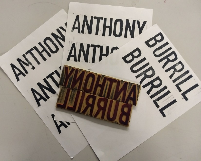
The spread features Anthony Burrill’s letterpress posters and I decided I wanted to imitate the look of them in the title. To do this I made a stamp of his name and printed it onto paper. I then scanned it and tidied it up in Photoshop and used the images as the heading of the article.

IMG_20171130_173652623.jpg

The final stage was to make add the features that would make it look like it belongs in a magazine. For this I looked at the magazine “Computer Arts” and duplicated all the elements they put on each page, including page numbers, their website, and the date.

a3 double page spread v4

Above is the PDF I sent to print and below is a mockup of what the spread would look like in an actual magazine made in Photoshop.

magzine.jpg

The Poster – Final Design

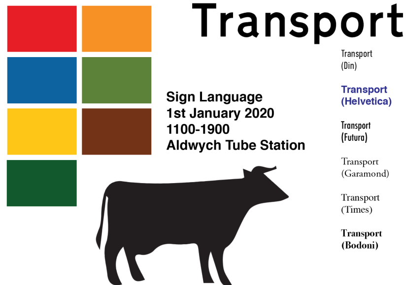
For my Final poster design I decided that I was going to base it on roundabout symbols. One of my first design ideas was to arrange the information on the poster around a roundabout so that it would look like a road sign. I started by selecting a font from the six we were allowed to use. I wanted to use the one that most closely resembled the “Transport” font Calvert designed so I found a sample of the font and compared it to each font. I decided that Helvetica was the closest font as it is a sans-serif typeface and the sizes of the letters and the spacing between them most closely resembles “Transport”.

The second thing I did was select the colours I was going to use and to do this i went to the gov.uk website (https://www.gov.uk/guidance/traffic-sign-images) where the exact colours used on uk road signs are listed.Screen Shot 2017-11-30 at 16.34.26.png

I then moved on to tracing some roundabout shapes on illustrator and arranging them to create the background of the poster. My initial idea was to have a few roundabouts in the background and then to have one black one in front and try to imitate the layout of an actual roundabout.

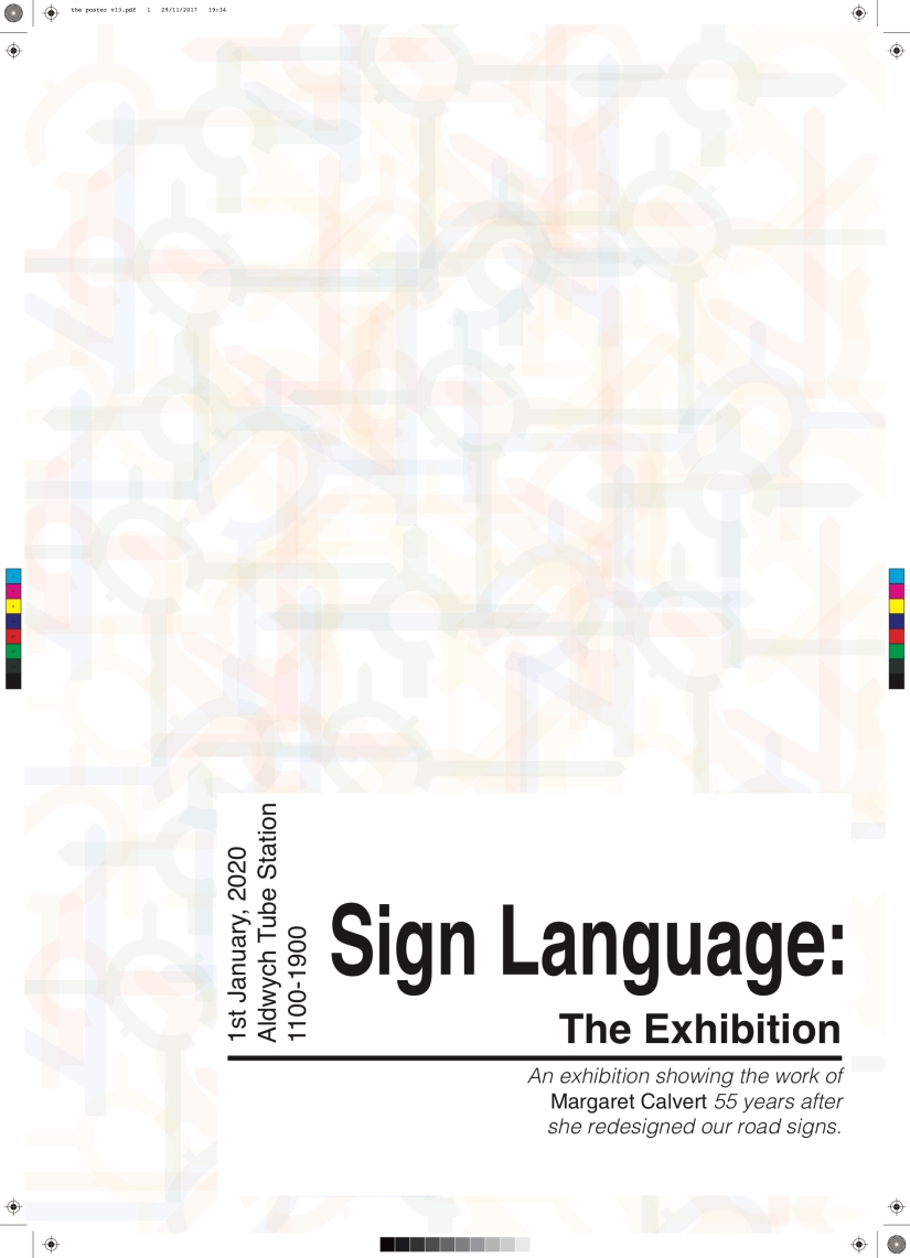
I then decided to go for a slightly more abstract look and used the roundabout shapes I initially created as the background. Instead of having one of each I used multiple copies of the group layered on top and around each other. I think this resulted in a more coherent design and even though there are more individual elements in  the background they actually work together as one more subtle element. I tried to keep the text simple and stuck to one font (helvetica) and varied the weight and size of the text to add hierarchy to the information being displayed. The white rectangle was used to make the text clearer and easier to read because, like the roadsigns.

My final design can be seen below as the PDF I had printed.

the poster v13.jpg

the poster v13

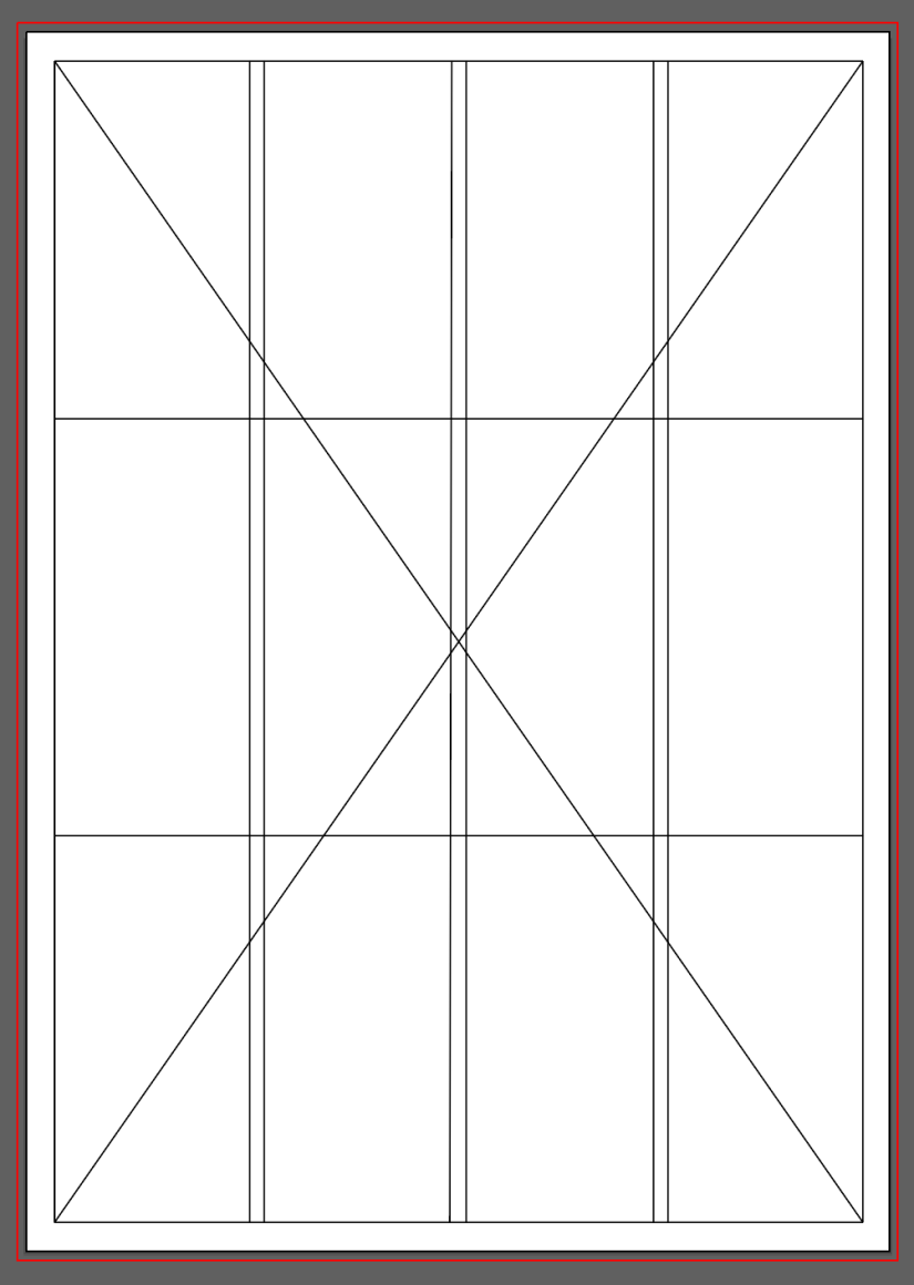
Below is the grid I used for the poster layout.

Screen Shot 2017-11-30 at 17.01.34.png

The Intervention – Part 3

The final part of the our final brief was the installation of our signs. After discussing the arrows my team agreed to stick the arrows down and we decided to put them on the “wrong” side to see if people would walk on the right even though the majority of people would be used to walking/driving on the left.

Along the corridor we put up all the signs we had each made. The purpose of these was to catch peoples attention so that we could observe their reaction, this means that we didn’t actually expect people to run down the corridor because a sign told them to.

In reality most people paid very little attention to the signs and didn’t seem to really notice them unless they were intentionally looking at the installations around DJCAD. However, the arrows did actually have a very big impact on how people were behaving. Despite normally walking on the left of corridors, a large percentage of people subconsciously started walking on the right (like the arrows suggested. Additionally, I noticed that people were more likely to follow the arrows if they were alone then they were if they were in a group. I think this is really interesting  and could be an indication of how different factors could affect how likely we are to follow signs and by extension rules. I also observed that people were more likely to follow the arrows the second or third time they walked by. I actually expected the opposite to be true because I thought they would get used to the signs and start ignoring them but in reality they just accepted the change and adhered to it.

Overall I think the arrows were actually the most successful part of the whole installation because they actually affected the way people were moving around the space and started conversations. I feel the signs were less successful as they didn’t really have an impact on the way people were acting. However, I do still think it was fairly successful and our “Intervention” fulfilled the purpose set out in the brief: “Create physical signage and/or objects that will affect the behaviour of people within a chosen space both physically and mentally. ” And the arrows definitely did this.

To be honest,  I don’t think my group worked very well together. For starters, one member of the group was never in class and as a result didn’t take part in the brief. Additionally, we really struggled to come up with an idea that everyone was happy with and as a result people kept on making decisions without talking to the rest of the group which lead to changes in the design. However, in the end we did actually have a fairly successful project and learnt a lot.


The Intervention – Part 2

The second part of this brief was making the individual signs that would make up the installation. We decided that we would all make a couple of signs separately all based on road signs and then use them all so that we could all get another opportunity to use Illustrator. I decided that I would base my signs very closely on actual road signs but change them slightly so that they would hopefully catch peoples attention.

Before making the signs, I made the arrows we were going to use on the ground to direct people. I started by cutting 25 paper arrows out of A4 paper and placing black insulation tape around the edge (this was to make them look more deliberate as well as to make them stronger).  I then placed a strip of double sided sticky tape on the back of each arrow so that it would be easy to stick them to the ground and remove them. After I started making the arrows, my team said that they didn’t want to use them and they wanted to just put the signs up, however I decided to finish making them because I thought that without them we didn’t really have a concept and I had already done most of the work for them anyway.

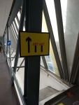
The first sign I made was based on a lane closed sign. I realised that people do sometimes use the design of road signs for signs in buildings and I didn’t want my signs to get confused with those signs so I decided to use this image because I thought this was a sign that wouldn’t really ever be used in buildings.

On Illustrator I recreated the sign and changed the traditional red blocks to the word “ART’ and printed this A3 so that it would be as similar to the original as I could make it. I thought we could potentially use this as the first sign in our intervention because it would act as a sort of warning to prepare people for the rest of the signs.

I did the same again for a diversion sign but I drew four arrow all pointing in different arrows, the aim of this one was to see if people would actually notice the sign.

By the end of the making process I had made two A3 road signs and 25 paper arrows for the installation.

The Intervention – Part 1

The third week of this module was spent on our third and final brief in Picture, Symbol, Icon. The title was “The Intervention”: in teams we were asked to create an intervention in a space within the DJCAD buildings. The aim was to make people stop and think. The first thing our team did was walk around DJCAD and take photos of signs that already exist in the building to see how our projects could fit in.

This reminded me of the work I did earlier in this module on the poster for Margaret Calvert’s work and her use of colour. It was easy to sort the signs and their purposes based on their colour – e.g. green signs are about safety and yellow signs give warnings. I thought this could be an interesting aspect of the signs for us to look at.

After this we started brainstorming possible ideas and spaces as a team. The first thing we all agreed on was that we needed to pick a location that would have a reasonable number of people walking past so that we could get an accurate representation of the range of reactions people would have to whatever we installed in that location. The three main areas we identified within DJCAD as possible locations were: reception (where most people enter the building), the lifts or stairs (because we wouldn’t be competing for people’s attention), or the bridges between the two areas (because they have a unique purpose within the buildings).

The three main ideas we came up with as a group were:
– replacing the signs in the lifts with whiteboards and leaving pens next to it so that people could write on them.
– putting out signs that look like wet floor signs that say “the floor is lava”
– lines drawn on the ground that would influence the way people walk.

We finally decided to redesign roadsigns and use arrows on the ground to influence how people would walk down the bridge between the Mathew and Crawford buildings on level 5 in DJCAD.