For our second brief in Picture Symbol Icon we were asked to pick one of six articles about designers and design a double page spread for the article. After reading the six articles I decided to base my work on the article about Anthony Burrill. (https://www.smashingmagazine.com/2014/01/anthony-burrill-work-hard-be-nice-to-people/)
Anthony Burrill is a Graphic Artist, Printmaker, and Designer and is famous for his text based compositions which utilise primary colours and geometric shapes. Burrill studied graphic design and Leeds Polytechnic and then completed an MA in Graphic Design at The Royal College of Art. He has had work exhibited in The V&A in London and the Cooper-Hewitt National Design Museum in New York, and has worked with a range of companies and organisations including Google, Apple, and the London Underground.
Arguably his most famous work is his letterpress posters and the most famous piece is his “Work hard & be nice to people” poster.


 Credit: http://anthonyburrill.com/
The article I have chosen is based on an interview with Anthony Burrill and in it he discusses the introduction of digital techniques and how this has impacted the had on how he works, including how he has tried to maintain a handcrafted feel in his work. He also discussed curating phrases, the importance of context, and how people can respond to your work in a way you wouldn’t expect.
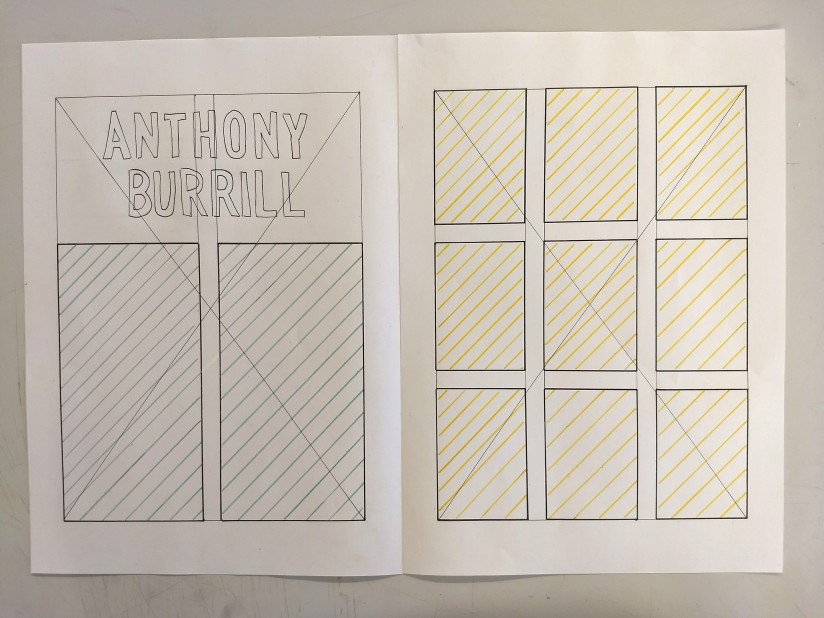
I have drafted some initial ideas for the layout of my double page spread which I have included below. For the titles I have used the font Din as I feel this most closely resembles Anthony Burrill’s work as it is a very geometric sans serif font. In the first design I tried to include a lot of white space to emulate the clean look of Burrill’s work. the orange boxes in this design would be images of his posters including one very large image in the top right corner of the second page. The text would be slit across three columns with the majority being in the fourth column. It would be slit into blocks with contrasting headings based n on the questions asked in the interview.
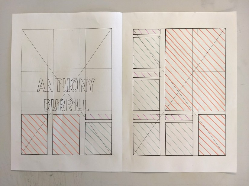
In my second design the first page would be based on a two column grid with the text split across both columns, but all on one page. The second page of the double page spread would be entirely comprised of images of Anthony Burrill’s work in a very regular grid which emulate the very rigid structure he uses in his posters which comes from the traditional techniques he uses.