Our final project in ‘Ways of Making’ was ‘Navigating Experiences’ which lasted two weeks and focused on how we interact with the Urban landscape. The brief was to design a new experience in pairs for a user to playfully navigate a place. We were also encouraged to think about getting lost, exploring, asking someone for directions, and picking a random route. Mainly because most new navigating experiences allow us to avoid these experiences but prevent us from interacting with our surroundings and people around us.
As this was such an open brief we decided our first step should be to decide what we wanted to design and who we wanted to design it for. Our main inspiration was the Dead Drops network, especially the way it allows you to share digital information while making you go to a physical location to get it. From this we decided that we wanted to have a physical product in set locations around a city and an app that would know where they are and send you to them to get information. We also decided that our app would be aimed at everyone and encourage to get to know their city.
We finally decided that our app would be called EARTH and would use your interests and needs to give you a list of places to visit in a city. Instead of giving you a route to follow, the app guides you with an arrow so that you still have to explore the city to find your route. Once you get to a location you will be given a picture of an object to fin. Once you take a picture through the app AR technology within it will give you information about the place, advice from local people, and music to listen to. When you first sign up for the app you will be asked about your interest, your preferences, and some basic information which the app will use to tailor your experience and ensure that all suggested locations meet your needs. When you go to use the app it will ask you: where you are, how long you want to spend, what your budget is, what type of day you want to have, and if you have any requirements; using this information the app will generate a list of places for you to visit.
We started by doing some rough sketches of the app pages so that we could brainstorm and make sure we included all the features of the app, we then made a paper model of the app which gave us a better idea of how the pages would work together in reality. After establishing the content of the app we needed to work on how the app would look so we did some more sketches, in colour, and then made a prototype app and a 3d drawing on rhino to see what the app would look like on a phone.
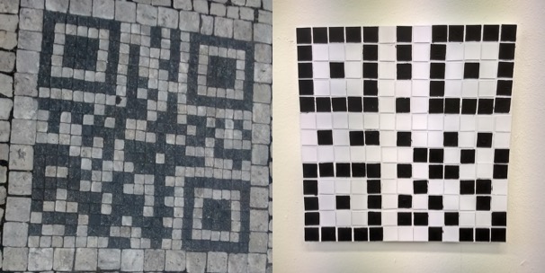
Our design changed a lot over the two weeks, however the aspect that changed the most was the physical presence in each location. Initially we wanted to have some kind of ‘touch pad’ at each location which would change colour to show how many people had visited that location, the user would touch their phone to it and it would connect and transfer files, very much like the dead drops network, however a lot of the dead drops USBs are either broken or corrupted and this made us realise how much upkeep and money this would take. Our next idea was inspired by a QR code I found in Prague built into the pavement. This would work really well in a single city if you worked with the local council, however if you made the project global this would be almost impossible. So we finally decided that when someone wanted to submit a location to be added they would take a picture of a noteworthy permanent feature of the location and we would then use AR technology to incorporate it into the app.
We had two other ideas for the app that we decided against in the end. The first was to make the app more like current social media sites in that you could share your experiences with friends and ‘follow’ them. We decided, however, that this wouldn’t be safe for an app based on location. We did consider safety measures like making the ‘following’ system very secure and using ‘delayed posting’ which would use your location to ensure that you’re not near the place you’re posting about when the post is actually uploaded, however we decided that we wouldn’t be able to stop people from abusing this feature and as a result we did not include it. The other idea was to create a worldwide competition between the cities with the app in place to see which was the most engaged city, however we decided we wanted the app to be more about exploring your own city and other cities so we decided to also not include this feature.
In conclusion, I’m really happy with how far we got with the development of the app, I feel that we had a really good idea of all the features and how they would work together and we had a working prototype. I do, however, think there are still issues with our design, mainly that while it does encourage you to explore your city it does not really encourage human interaction and still uses mobile phones. It would have been nice to be able to remove phones from the equation but the vast majority of people have one the easiest way to make something accessible is to make it available in their phones. Additionally I think we worked well as a team in that we were good at dividing up the work and we got a lot done in the two weeks, however, I think following two one week projects with a two week project made us feel like we had a lot more time then we actually had which made time management difficult. Over the last four weeks I have learnt the importance of planning and I think this finally showed in this project as well as improving my modelling skills and how important and useful modelling is for design.
